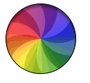
원 로딩 애니메이션
Apple의 OS X 서클 로딩 애니메이션을 만들려고합니다.
내가 지금까지 시도한 것 :
.animation-wrapper {
  width: 200px;
  height: 200px;
  border: 1px solid black;
  border-radius: 50%;
  position: relative;
  overflow: hidden;
  filter: brightness(0.8);
  -webkit-filter: brightness(0.8);
}
.pie-piece1 {
  position: absolute;
  width: 50%;
  height: 50%;
  bottom: 0;
  left: 0;
  background: linear-gradient(to right, rgba(255, 0, 0, 1) 0%, rgba(255, 255, 0, 1) 100%);
}
.pie-piece2 {
  position: absolute;
  width: 50%;
  height: 50%;
  bottom: 0;
  right: 0;
  background: linear-gradient(to right, rgba(255, 255, 0, 1) 0%, rgba(0, 255, 0, 1) 100%);
}
.pie-piece3 {
  position: absolute;
  width: 50%;
  height: 50%;
  top: 0;
  left: 0;
  background: linear-gradient(to right, rgba(255, 0, 0, 1) 0%, rgba(255, 0, 255, 1) 100%);
}
.pie-piece4 {
  position: absolute;
  width: 50%;
  height: 50%;
  top: 0;
  right: 0;
  background: linear-gradient(to right, rgba(255, 0, 255, 1) 0%, rgba(0, 0, 255, 1) 100%);
}
.rotating-spinners {
  position: absolute;
}
.spike {
  fill: rgba(22, 22, 22, 0.5);
}
<figure class="animation-wrapper">
<div class="pie-piece1"></div>
<div class="pie-piece2"></div>
<div class="pie-piece3"></div>
<div class="pie-piece4"></div>
<svg class="rotating-spinners" width="100%" height="100%" viewBox="0 0 100 100" xmlns="http://www.w3.org/2000/svg" xmlns:xlink="http://www.w3.org/1999/xlink">
<defs>
<path id="spin-part" class="spike" d="M 65,-40 C 65,-40 80,20 50,50 60,40 50,-40 50,-40Z" />
</defs>
<use x="0" y="0" xlink:href="#spin-part" />
<use x="0" y="0" xlink:href="#spin-part" transform="rotate(60, 50, 50)" />
<use x="0" y="0" xlink:href="#spin-part" transform="rotate(120, 50, 50)" />
<use x="0" y="0" xlink:href="#spin-part" transform="rotate(180, 50, 50)" />
<use x="0" y="0" xlink:href="#spin-part" transform="rotate(240, 50, 50)" />
<use x="0" y="0" xlink:href="#spin-part" transform="rotate(300, 50, 50)" />
</svg>
</figure>그라디언트를 두 방향으로 만드는 방법을 찾을 수 없기 때문에 선형 그라디언트가 올바르게 정렬되지 않은 것 같습니다.
내가했던 것처럼 섞지 않고 CSS 또는 SVG 만 사용하여 이것을 만드는 방법이 있습니까?
아니면 캔버스 나 일종의 이미지 마법처럼 사용할 수있는 다른 솔루션이 있습니까?
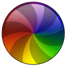
여기 내 노력이 있습니다. 원뿔형 그래디언트는 OP가 게시 한 애니메이션 GIF의 각 픽셀의 최대 값을 계산하여 추출한 포함 된 비트 맵 이미지입니다. 반투명 검은 풍차 패턴이 그 위에 겹쳐지고 애니메이션되며 흐림 필터는 JPEG 인공물을 제거합니다.
(편집 : 좀 더 3D로 보이도록 반사 하이라이트 추가)
<svg xmlns="http://www.w3.org/2000/svg" xmlns:xlink="http://www.w3.org/1999/xlink"
width="121" height="121" viewBox="0 0 121 121">
<defs>
<clipPath id="circ">
<circle r="60" cx="60.5" cy="60.5"/>
</clipPath>
<linearGradient id="shine" x1="0%" y1="0%" x2="0%" y2="100%">
<stop offset="0%" style="stop-color:#fff;stop-opacity:0.6" />
<stop offset="10%" style="stop-color:#fff;stop-opacity:0.3" />
<stop offset="20%" style="stop-color:#fff;stop-opacity:0.1" />
<stop offset="40%" style="stop-color:#fff;stop-opacity:0" />
</linearGradient>
<filter id="blur">
<feGaussianBlur in="SourceGraphic" stdDeviation="2"/>
</filter>
</defs>
<image width="121" height="121" filter="url(#blur)" xlink:href="data:image/jpeg;base64,
/9j/4AAQSkZJRgABAQEASABIAAD/2wBDACAWGBwYFCAcGhwkIiAmMFA0MCwsMGJGSjpQdGZ6eHJm
cG6AkLicgIiuim5woNqirr7EztDOfJri8uDI8LjKzsb/2wBDASIkJDAqMF40NF7GhHCExsbGxsbG
xsbGxsbGxsbGxsbGxsbGxsbGxsbGxsbGxsbGxsbGxsbGxsbGxsbGxsbGxsb/wgARCAB5AHkDASEA
AhEBAxEB/8QAGQAAAwEBAQAAAAAAAAAAAAAAAAECBAMF/8QAGAEAAwEBAAAAAAAAAAAAAAAAAAEC
AwT/2gAMAwEAAhADEAAAAfQAXAM9O7YlzoXdLQ5QAIMSL6gA0DS50G6UyRYUyi2NBQhoHMMNzzM2
VX0BgwKQqSHJDWvTk/McagAMC0TcBUoA9LM8x49ACBjNJlawIlgl0kh8/SIAAekwbYgJiSEUc3WA
AIdRBrgAhggLOfsAGxVc5xFc6WiBgN08O0AdKbqM551lKuBUjpV1OXWNN0oqohQ84V5pUr3aac8u
fQ3FOpmnMKXEzWSVLX322WVXD59aamnMEkTNZzehre+ogzLn0p5lEyJzMvN6emmXQAuSIrlunmKX
E9OhdHswAAAJzQ+tcbnnqtFdSAAD/8QAIBAAAgICAwADAQAAAAAAAAAAAQIAEQMwEBIgIjFAIf/a
AAgBAQABBQLlsoE+TQIJ1EoTqIUE+SxcoPt3LQLWhluJkKnxkfsR/NRFzG/U8ZWoLsaYXsRj2fah
6vcG4zv+ipX4CPwH30jCm2qLapkW92NaHDLWxFvyVrUFv2U0BdJ+oODwPrz/AP/EABwRAQACAgMB
AAAAAAAAAAAAAAEAEAIgETAxIf/aAAgBAwEBPwGvN/Nzox87Hod2O+T8nO+Ud2NkPKYxvHyYNNMa
Ji8OjGB9sbYwNOegp0//xAAfEQABBAMAAwEAAAAAAAAAAAABAAIRIBAwMQMSIUH/2gAIAQIBAT8B
pKI0BOEaD9Gk0CGX9oEMkTRugOheylTUoFTcUPajAT9DhIsz7l4irRAyRKc0jLGfpq/mPH2n/8QA
HhAAAQQBBQAAAAAAAAAAAAAAEQEgITAQAAJAUHD/2gAIAQEABj8CzFEvCVDc0JYFyPADceljUvni
/wD/xAAdEAADAAIDAQEAAAAAAAAAAAAAAREQMSAhQTBh/9oACAEBAAE/Ic9R2Y3vcR6iHh+A2+Hi
6LrdR1PR8m0lWNfEVtvFLilwnTpnggTTVXBnhCpClKUpSlKKUd4+evbYkRSlKUpSlKUSq+nRvaxY
ZSlKUpSlKUpSC/GTlSlKUpSlLi5VypRvnOcKn0QhBInWCEJyhMQglhBomJiFFREIQgkLDGhomZiJ
JI2sQSIImGhog0Qh3DbzbVrMEuDRCYrr1waqjHa6FzYxz96EoouXp0O1oLgzt6R69vlPZrl7zv/a
AAwDAQACAAMAAAAQCZ9GgAVrOID+MKOo0R0OMKN+ec1rZcb1FaGkEgox777+BDUwvvfOejgbCEVt
p82ChkNz+AVXCzANstqAAEMAAP/EABoRAAMBAQEBAAAAAAAAAAAAAAABERAgITH/2gAIAQMBAT8Q
Eq4eeENso1wlHa1j9Jj4SVrGXUokiEHh4iExjansPgb0pS8SwvLPQkZSixjwvurR6g+C8UeEHh8S
RTAYx7W1ZDHhCS1OMVDGJc/XT//EABsRAQEBAQEBAQEAAAAAAAAAAAEAERAhMSBh/9oACAECAQE/
EOHlsItTT9kstHnGIiODw4/eERZEMU6PAs4PrpyO+S3mz1vlttvdiWwXtvNtlzINvNlllDDDt5my
ywyhvmGOyy2wwwwYcBZbYYYa7u/ktsMfjCGMz7w98s/0D9/J/8QAIxABAAICAgICAgMAAAAAAAAA
AQARECExQSBRMGGhsXGBkf/aAAgBAQABPxDCgWxl/q4naJ0QW2rDhCfVnIGK21QfaF0xz/bgiWeL
pKCIXTuzfbRYZLyX7mygIbujDSWOVotlzdeX3KUc/EAKA8y1W3DBssxuGW2eX4AL4dpnCbP68Khw
NHixgcD4sUjkpn3zhfcvwBJDDgcV4K6rkl/UVS5cuXLhDpgtwMuEduFeFSmWl1yKOZUqVKm5WKlS
sCCbXiB6Sh4jLgrwrJULQ6E6IFFZVisKw/mjdRdmQgjsglQalmFiokfqrtn1zQkAvwAwiomBwGGk
1BgSymPWb/iBAhgBKlYGGEiCWv5gUUZJgsY7e36ylagQIEqJEggqXoV+8IgoPFBKYS229RtpD7jH
hIYYg5SFtM/cMbbeoFFHwc04MnGHKcXl/9k=" clip-path="url(#circ)" />
<g transform="translate(60.5,60.5)">
<path d="M0 0A56 56 0 0 0 0 56 56 56 0 0 0 32.916 45.305 56 56 0 0 1 0 0 56
56 0 0 0 53.259 17.305 56 56 0 0 0 53.259-17.305 56 56 0 0 1 0 0 56 56
0 0 0 32.916-45.305 56 56 0 0 0 0-56 56 56 0 0 1 0 0 56 56 0 0 0
-32.916-45.305 56 56 0 0 0-53.259-17.305 56 56 0 0 1 0 0 56 56 0 0 0
-53.259 17.305 56 56 0 0 0-32.916 45.305 56 56 0 0 1 0 0Z"
stroke="none" fill="#000" opacity="0.25" transform="rotate(0)">
<animateTransform attributeName="transform" type="rotate" from="0"
to="72" begin="0s" dur="0.6s" repeatCount="indefinite" />
</path>
<circle r="59" stroke="#000" stroke-width="2" fill="none" opacity="0.25" />
<circle r="55" fill="url(#shine)" stroke="none" />
</g>
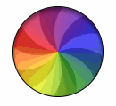
</svg>여기 내 SVG 전용 버전이 있습니다. 배경 색상환이 완벽하지는 않지만 상당히 가까워진 것 같습니다.
<svg width="135" height="135" viewBox="0 0 200 200">
    <defs>
        <filter id="blur" color-interpolation-filters="linear">
            <feGaussianBlur in="SourceGraphic" stdDeviation="11"/>
        </filter>
        <mask id="mask">
            <circle cx="0" cy="0" r="90" fill="white"/>
        </mask>
        <linearGradient id="gloss" x2="0" y2="0.4">
            <stop offset="0" stop-color="white" stop-opacity="0.5"/>
            <stop offset="1" stop-color="white" stop-opacity="0"/>
        </linearGradient>
    </defs>

    <g transform="translate(100,100)" mask="url(#mask)">
        <g filter="url(#blur)">
            <polygon points="0,0, -100,-26.8, -100,26.8" fill="#c44"/>
            <polygon points="0,0, -100,-26.8, -100,26.8" fill="#c09" transform="rotate(30)"/>
            <polygon points="0,0, -100,-26.8, -100,26.8" fill="#c0c" transform="rotate(60)"/>
            <polygon points="0,0, -100,-26.8, -100,26.8" fill="#90c" transform="rotate(90)"/>
            <polygon points="0,0, -100,-26.8, -100,26.8" fill="#44c" transform="rotate(120)"/>
            <polygon points="0,0, -100,-26.8, -100,26.8" fill="#09c" transform="rotate(150)"/>
            <polygon points="0,0, -100,-26.8, -100,26.8" fill="#0cc" transform="rotate(180)"/>
            <polygon points="0,0, -100,-26.8, -100,26.8" fill="#0c9" transform="rotate(210)"/>
            <polygon points="0,0, -100,-26.8, -100,26.8" fill="#4c4" transform="rotate(240)"/>
            <polygon points="0,0, -100,-26.8, -100,26.8" fill="#9c0" transform="rotate(270)"/>
            <polygon points="0,0, -100,-26.8, -100,26.8" fill="#cc0" transform="rotate(300)"/>
            <polygon points="0,0, -100,-26.8, -100,26.8" fill="#c90" transform="rotate(330)"/>
        </g>
        <g transform="scale(0.9,0.9)">
            <path d="M0,0C5,-61,-32,-86,-95,-90L-100,-46C-65,-53,-24,-35,0,0Z" fill="black" fill-opacity="0.4"/>
            <path d="M0,0C5,-61,-32,-86,-95,-90L-100,-46C-65,-53,-24,-35,0,0Z" fill="black" fill-opacity="0.4" transform="rotate(60)"/>
            <path d="M0,0C5,-61,-32,-86,-95,-90L-100,-46C-65,-53,-24,-35,0,0Z" fill="black" fill-opacity="0.4" transform="rotate(120)"/>
            <path d="M0,0C5,-61,-32,-86,-95,-90L-100,-46C-65,-53,-24,-35,0,0Z" fill="black" fill-opacity="0.4" transform="rotate(180)"/>
            <path d="M0,0C5,-61,-32,-86,-95,-90L-100,-46C-65,-53,-24,-35,0,0Z" fill="black" fill-opacity="0.4" transform="rotate(240)"/>
            <path d="M0,0C5,-61,-32,-86,-95,-90L-100,-46C-65,-53,-24,-35,0,0Z" fill="black" fill-opacity="0.4" transform="rotate(300)"/>
            <animateTransform attributeType="xml" attributeName="transform" type="rotate" from="0" to="360" dur="4s" repeatCount="indefinite"/>

        </g>
        <circle r="83" fill="url(#gloss)"/>
        <circle r="90" fill="none" stroke="black" stroke-width="2"/>
    </g>
</svg>
캔버스 접근
이것은 사용자 상호 작용이 거의없이 치수가 고정 될 수있는 로딩 애니메이션이므로, Canvas는 DOM에 추가 요소를 추가하지 않기 때문에 좋은 옵션이 될 것 입니다. 캔버스 그리기 명령은 SVG와 매우 유사하며 브라우저 지원 도 나쁘지 않습니다.
한 가지 단점은 Canvas에는 SVG와 달리 자체 흐림 필터가 없다는 것입니다. 그러나 CSS 흐림 필터 (브라우저 지원이 매우 낮음) 또는 이 Stack Overflow 스레드에 언급 된 라이브러리를 사용하여 극복 할 수 있습니다 .
배경 그라디언트 휠 :
배경 그라디언트 휠은 여기 내 대답에 자세히 설명 된 것과 유사한 접근 방식을 사용하여 만들어 집니다 . 기본적으로 우리는 원에서 여러 점을 찾고 각각 다른 색상의 획을 가진 선을 그립니다. hue모든 선의 값을 수정하여 그라디언트 휠을 칠할 수 있습니다.
아래 스크린 샷에서 첫 번째 그림은 24 개의 선 ( hue모든 선 사이에 15 개의 변경) 만 그렸을 경우 배경이 어떻게 보 였는지 보여주고 두 번째 그림은 hue증분되는 총 360 개의 선이있는 실제 그래디언트 휠입니다. 각 줄에 대해 1 씩.

부채:
팬은 SVG 스 니펫에서 사용 된 것과 동일한 접근 방식을 사용하여 생성됩니다. 경로 명령은 각 스포크를 그리는 데 사용됩니다. useSVG에서는 모양을 반복하기 위해 태그를 사용 하지만 Canvas에서는 루프를 사용할 수 있습니다.
SVG와 Canvas의 주요 차이점은 Canvas는 rotate함수 의 매개 변수로 변환 원점을 취할 수 없으므로 회전을 적용하기 전에 컨텍스트를 중심점으로 변환해야한다는 것입니다.
마지막으로 기본 모양이 정사각형 (높이와 너비가 같기 때문에)이므로 캔버스를 원으로 잘라야합니다. 아래 스크린 샷은 잘리지 않고 잘린 팬 버전을 보여줍니다.

이 팬은 배경 그라데이션 휠 위에 배치됩니다.
3D 효과 :
상단의 3D 효과는 배경과 팬에 더 높은 투명도를 가진 작은 호를 추가하여 제공됩니다.
아래는 애니메이션이없는 전체 사진의 스크린 샷입니다.

생기:
window.requestAnimationFrame인자로 전달 된 함수를 일정한 간격으로 호출 하는 방법을 사용하여 애니메이션을 추가 합니다. 이 방법은 일반적으로 MDN에 따라 초당 약 60 번 함수를 호출합니다. counter반복 할 때마다 변수 값을 증가시키고 팬의 스포크 각도에 추가함으로써 애니메이션 효과를 얻을 수 있습니다.
window.onload = function() {
  var canvas = document.querySelector("#canvas"),
    ctx = canvas.getContext("2d"),
    counter = 360;

  function fan() {
    ctx.clearRect(0, 0, 100, 100);
    for (var i = 0; i < 360; i++) {
      ctx.strokeStyle = "hsl(" + (180 - i) + ", 60%, 50%)";
      ctx.beginPath();
      ctx.moveTo(50, 50);
      x = 50 + 50 * Math.cos((i / 360) * Math.PI * 2);
      y = 50 + 50 * Math.sin((i / 360) * Math.PI * 2)
      ctx.lineTo(x, y);
      ctx.lineWidth = 2;
      ctx.stroke();
    }
    counter++;
    for (var j = 0; j < 6; j++) {
      ctx.save();
      ctx.beginPath();
      ctx.arc(50, 50, 50, 0, Math.PI * 2, true);
      ctx.clip();
      ctx.translate(50, 50);
      ctx.rotate(((60 * j) + counter) * Math.PI / 180);
      ctx.beginPath();
      ctx.moveTo(0, 0);
      ctx.bezierCurveTo(0, 0, 30, 50, 100, 0);
      x = 75 * Math.cos((-20 / 360) * Math.PI * 2);
      y = 75 * Math.sin((-20 / 360) * Math.PI * 2)
      ctx.lineTo(x, y);
      ctx.bezierCurveTo(x, y, (x - 30), (y + 40), 0, 0);
      ctx.closePath();
      ctx.fillStyle = "rgba(0,0,0,0.5)";
      ctx.fill();
      ctx.restore();
    }
    ctx.save();
    ctx.beginPath();
    ctx.arc(50, 50, 50, 0, Math.PI, true);
    ctx.arc(50, 55, 50, Math.PI, 0, false);
    ctx.fillStyle = "rgba(0,0,0,0.15)";
    ctx.closePath();
    ctx.fill();
    ctx.restore();
    window.requestAnimationFrame(fan);
  }
  fan();
}
<canvas width='100px' height='100px' id='canvas'></canvas>SVG 접근
위에서 설명한 것과 동일한 접근 방식을 SVG에서도 사용할 수 있습니다. 유일한 단점은 아니오입니다. 배경과 팬 모두에 대해 DOM에 추가되는 추가 요소의 수입니다.
window.onload = function() {
  var colorWheel = document.querySelector("#color-wheel");
  for (var i = 0; i < 360; i++) {
    lineColor = "hsl(" + (180 - i) + ", 60%, 50%)";
    x = 50 + 50 * Math.cos((i / 360) * Math.PI * 2);
    y = 50 + 50 * Math.sin((i / 360) * Math.PI * 2);
    line = document.createElementNS("http://www.w3.org/2000/svg", "line");
    line.setAttribute('x1', 50);
    line.setAttribute('y1', 50);
    line.setAttribute('x2', x);
    line.setAttribute('y2', y);
    line.setAttribute('stroke', lineColor);
    line.setAttribute('stroke-width', 2);
    colorWheel.appendChild(line);
  }
}
<svg class="rotating-spinners" width="100px" height="100px" viewBox="0 0 100 100" xmlns="http://www.w3.org/2000/svg" xmlns:xlink="http://www.w3.org/1999/xlink">
<defs>
<path id="spin-part" class="spike" d="M 50,50 c0,0 30,50 100,0 l-5,-35 c0,0 -30,50 -95,35Z" />
<clipPath id="shape">
<circle r="50" cx="50" cy="50" />
</clipPath>
<clipPath id="shade">
<path d='M-5,55 a55,55 1 0,1 110,0 h-5 a50,50 1 0,0 -100,0' />
</clipPath>
</defs>
<g id='color-wheel' clip-path='url(#shape)'>
</g>
<g id='fan' fill-opacity="0.5" clip-path='url(#shape)'>
<use x="0" y="0" xlink:href="#spin-part" />
<use x="0" y="0" xlink:href="#spin-part" transform="rotate(60, 50, 50)" />
<use x="0" y="0" xlink:href="#spin-part" transform="rotate(120, 50, 50)" />
<use x="0" y="0" xlink:href="#spin-part" transform="rotate(180, 50, 50)" />
<use x="0" y="0" xlink:href="#spin-part" transform="rotate(240, 50, 50)" />
<use x="0" y="0" xlink:href="#spin-part" transform="rotate(300, 50, 50)" />
<animateTransform attributeType="xml" attributeName="transform" type="rotate" from="0,50,50" to="360,50,50" dur="6s" repeatCount="indefinite" />
</g>
<circle r='50' cx='50' cy='50' fill-opacity='0.15' clip-path='url(#shade)' />
</svg>혼합 접근법
또는 팬을위한 추가 요소에 문제가 없지만 추가되는 360 line요소 를 피하고 싶다면 아래 스 니펫과 같이 팬을 위해 Canvas (배경 용)와 SVG를 혼합하여 사용할 수 있습니다.
window.onload = function() {
  var canvas = document.querySelector("#canvas");
  var ctx = canvas.getContext("2d");

  for (var i = 0; i < 360; i++) {
    ctx.strokeStyle = "hsl(" + (180 - i) + ", 60%, 50%)";
    ctx.beginPath();
    ctx.moveTo(50, 50);
    x = 50 + 50 * Math.cos((i / 360) * Math.PI * 2);
    y = 50 + 50 * Math.sin((i / 360) * Math.PI * 2)
    ctx.lineTo(x, y);
    ctx.lineWidth = 2;
    ctx.stroke();
  }
  ctx.save();
  ctx.beginPath();
  ctx.arc(50, 50, 50, 0, Math.PI, true);
  ctx.arc(50, 55, 50, Math.PI, 0, false);
  ctx.fillStyle = "rgba(0,0,0,0.15)";
  ctx.closePath();
  ctx.fill();
  ctx.restore();
}
div {
position: relative;
height: 100px;
width: 100px;
}
canvas,
svg {
position: absolute;
top: 0px;
left: 0px;
height: 100%;
width: 100%;
}<script src="https://cdnjs.cloudflare.com/ajax/libs/prefixfree/1.0.7/prefixfree.min.js"></script>
<div class='container'>
<canvas width='100px' height='100px' id='canvas'></canvas>
<svg class="rotating-spinners" width="100%" height="100%" viewBox="0 0 100 100" xmlns="http://www.w3.org/2000/svg" xmlns:xlink="http://www.w3.org/1999/xlink">
<defs>
<path id="spin-part" class="spike" d="M 50,50 c0,0 30,50 100,0 l-5,-35 c0,0 -30,50 -95,35Z" />
<clipPath id="shape">
<circle r="50" cx="50" cy="50" />
</clipPath>
</defs>
<g id='fan' fill-opacity="0.5" clip-path="url(#shape)">
<use x="0" y="0" xlink:href="#spin-part" />
<use x="0" y="0" xlink:href="#spin-part" transform="rotate(60, 50, 50)" />
<use x="0" y="0" xlink:href="#spin-part" transform="rotate(120, 50, 50)" />
<use x="0" y="0" xlink:href="#spin-part" transform="rotate(180, 50, 50)" />
<use x="0" y="0" xlink:href="#spin-part" transform="rotate(240, 50, 50)" />
<use x="0" y="0" xlink:href="#spin-part" transform="rotate(300, 50, 50)" />
<animateTransform attributeType="xml" attributeName="transform" type="rotate" from="0,50,50" to="360,50,50" dur="6s" repeatCount="indefinite" />
</g>
</svg>
</div>나는 SVG와 CSS 그래디언트를 혼합하여이 작업을 수행해야했는데, 이는 요청에 위배되지만 내가 아는 것입니다. 프로펠러 모양을 위해 주로 SVG 부분 인 원본 코드 중 일부를 사용했습니다.
방사형 그래디언트는 12 개의 li요소를 사용하여 만들어집니다 .
.wheel,
.umbrella,
.color {
  content: "";
  position: absolute;
  border-radius: 50%;
  width: 15em;
  height: 15em;
  margin: 0;
  padding: 0;
}
.wheel {
  overflow: hidden;
  width: 15em;
  height: 15em;
  position: relative;
}
.umbrella {
  position: relative;
  -webkit-transform: scale(1.35);
}
.color,
.color:nth-child(n+7):after {
  clip: rect(0, 15em, 15em, 7.5em);
}
.color:after,
.color:nth-child(n+7) {
  content: "";
  position: absolute;
  border-radius: 50%;
  left: calc(50% - 7.5em);
  top: calc(50% - 7.5em);
  width: 15em;
  height: 15em;
  clip: rect(0, 7.5em, 15em, 0);
}
.color:nth-child(1):after {
  background-color: #9ED110;
  transform: rotate(30deg);
  z-index: 12;
}
.color:nth-child(2):after {
  background-color: #50B517;
  transform: rotate(60deg);
  z-index: 11;
}
.color:nth-child(3):after {
  background-color: #179067;
  transform: rotate(90deg);
  z-index: 10;
}
.color:nth-child(4):after {
  background-color: #476EAF;
  transform: rotate(120deg);
  z-index: 9;
}
.color:nth-child(5):after {
  background-color: #9f49ac;
  transform: rotate(150deg);
  z-index: 8;
}
.color:nth-child(6):after {
  background-color: #CC42A2;
  transform: rotate(180deg);
  z-index: 7;
}
.color:nth-child(7):after {
  background-color: #FF3BA7;
  transform: rotate(180deg);
}
.color:nth-child(8):after {
  background-color: #FF5800;
  transform: rotate(210deg);
}
.color:nth-child(9):after {
  background-color: #FF8100;
  transform: rotate(240deg);
}
.color:nth-child(10):after {
  background-color: #FEAC00;
  transform: rotate(270deg);
}
.color:nth-child(11):after {
  background-color: #FFCC00;
  transform: rotate(300deg);
}
.color:nth-child(12):after {
  background-color: #EDE604;
  transform: rotate(330deg);
}
<div class="wheel">
<ul class="umbrella">
<li class="color"></li>
<li class="color"></li>
<li class="color"></li>
<li class="color"></li>
<li class="color"></li>
<li class="color"></li>
<li class="color"></li>
<li class="color"></li>
<li class="color"></li>
<li class="color"></li>
<li class="color"></li>
<li class="color"></li>
</ul>
</div>그런 다음이 12 개 요소를 함께 블러 링하여 부드러운 그라데이션을 형성 할 수 있습니다.
그런 다음 필요한 효과를 내기 위해 회전 부분을 애니메이션했습니다.
var rotation = 0;

$(document).ready(function() {
  setInterval(function() {
    rotation += 1;
    $('.wheel svg').css({
      'transform': 'rotate(' + rotation + 'deg)'
    });;
  }, 10);
});
.wheel,
.umbrella,
.color {
content: "";
position: absolute;
border-radius: 50%;
width: 15em;
height: 15em;
margin: 0;
padding: 0;
}
.wheel {
overflow: hidden;
width: 15em;
height: 15em;
position: relative;
}
.umbrella {
position: relative;
filter: blur(.75em);
-webkit-filter: blur(.75em);
-moz-filter: blur(.75em);
-o-filter: blur(.75em);
-ms-filter: blur(.75em);
filter: url(#blur);
filter: progid: DXImageTransform.Microsoft.Blur(PixelRadius='.75');
-webkit-transform: scale(1.35);
}
.color,
.color:nth-child(n+7):after {
clip: rect(0, 15em, 15em, 7.5em);
}
.color:after,
.color:nth-child(n+7) {
content: "";
position: absolute;
border-radius: 50%;
left: calc(50% - 7.5em);
top: calc(50% - 7.5em);
width: 15em;
height: 15em;
clip: rect(0, 7.5em, 15em, 0);
}
.color:nth-child(1):after {
background-color: #9ED110;
transform: rotate(30deg);
z-index: 12;
}
.color:nth-child(2):after {
background-color: #50B517;
transform: rotate(60deg);
z-index: 11;
}
.color:nth-child(3):after {
background-color: #179067;
transform: rotate(90deg);
z-index: 10;
}
.color:nth-child(4):after {
background-color: #476EAF;
transform: rotate(120deg);
z-index: 9;
}
.color:nth-child(5):after {
background-color: #9f49ac;
transform: rotate(150deg);
z-index: 8;
}
.color:nth-child(6):after {
background-color: #CC42A2;
transform: rotate(180deg);
z-index: 7;
}
.color:nth-child(7):after {
background-color: #FF3BA7;
transform: rotate(180deg);
}
.color:nth-child(8):after {
background-color: #FF5800;
transform: rotate(210deg);
}
.color:nth-child(9):after {
background-color: #FF8100;
transform: rotate(240deg);
}
.color:nth-child(10):after {
background-color: #FEAC00;
transform: rotate(270deg);
}
.color:nth-child(11):after {
background-color: #FFCC00;
transform: rotate(300deg);
}
.color:nth-child(12):after {
background-color: #EDE604;
transform: rotate(330deg);
}
body {
padding: 5px;
}
.wheel svg {
position: absolute;
top: 0;
opacity: .5;
}<script src="https://ajax.googleapis.com/ajax/libs/jquery/2.1.1/jquery.min.js"></script>
<figure class="animation-wrapper wheel">
<ul class="umbrella">
<li class="color"></li>
<li class="color"></li>
<li class="color"></li>
<li class="color"></li>
<li class="color"></li>
<li class="color"></li>
<li class="color"></li>
<li class="color"></li>
<li class="color"></li>
<li class="color"></li>
<li class="color"></li>
<li class="color"></li>
</ul>
<svg class="rotating-spinners" width="100%" height="100%" viewBox="0 0 100 100" xmlns="http://www.w3.org/2000/svg" xmlns:xlink="http://www.w3.org/1999/xlink">
<defs>
<path id="spin-part" class="spike" d="M 65,-40 C 65,-40 80,20 50,50 60,40 50,-40 50,-40Z" />
</defs>
<use x="0" y="0" xlink:href="#spin-part" />
<use x="0" y="0" xlink:href="#spin-part" transform="rotate(60, 50, 50)" />
<use x="0" y="0" xlink:href="#spin-part" transform="rotate(120, 50, 50)" />
<use x="0" y="0" xlink:href="#spin-part" transform="rotate(180, 50, 50)" />
<use x="0" y="0" xlink:href="#spin-part" transform="rotate(240, 50, 50)" />
<use x="0" y="0" xlink:href="#spin-part" transform="rotate(300, 50, 50)" />
</svg>
</figure>여기에 하나의 요소 만 사용하는 순수한 CSS 솔루션이 있습니다 . 이 이전 답변에서 만든 모양에 의존 하고 위에서 conic-gradient().
실제로는 conic-gradient()Chrome 및 Safari에서만 지원되지만 곧 더 나은 지원을 받게 될 것입니다.
.box {
  --R:50px; /*Radius*/
  --c1:grey; /*first color*/
  --c2:#fff; /*second color*/

  --g1:var(--c1) 98%, transparent 100%;
  --g2:var(--c2) 98%, transparent 100%;
  width:calc(2*var(--R));
  height:calc(2*var(--R));
  border-radius:100%;
  border:1px solid;
  position:relative;
  overflow:hidden;
  display:inline-block;
  background:conic-gradient(rgba(128, 0, 128,0.7), rgba(0, 0, 255,0.7),rgba(0, 128, 0,0.7),rgba(255, 255, 0,0.7), rgba(255, 0, 0,0.7), rgba(128, 0, 128,0.7));
  box-shadow:0 3px 5px inset rgba(0,0,0,0.5);
}
.box::before,
.box::after{
  content:"";
  position:absolute;
  z-index:-1;
  top:0;
  bottom:0;
  left:0;
  width:50%;
  background:
     /*we rotate by 30deg so will use :
       sin(30deg)*R = 0.5xR
       cos(30deg)*R = 0.866xR
     */
    radial-gradient(circle var(--R) at calc(var(--R) + 0.866*var(--R)) calc(var(--R) - 0.5*var(--R))  ,var(--g1)),
    radial-gradient(circle var(--R) at calc(var(--R) + 0.5*var(--R))   calc(var(--R) - 0.866*var(--R)),var(--g2)),
    radial-gradient(circle var(--R) at var(--R)                        0                              ,var(--g1)),
    radial-gradient(circle var(--R) at calc(var(--R) - 0.5*var(--R))   calc(var(--R) - 0.866*var(--R)),var(--g2)),
    radial-gradient(circle var(--R) at calc(var(--R) - 0.866*var(--R)) calc(var(--R) - 0.5*var(--R))  ,var(--g1)),
    radial-gradient(circle var(--R) at 0                               var(--R)                        ,var(--g2)),
    radial-gradient(circle var(--R) at calc(var(--R) - 0.866*var(--R)) calc(var(--R) + 0.5*var(--R))  ,var(--g1));
    transform-origin:right;
    animation:animate 3s linear infinite;
}

/*the same shape rotated*/
.box::after {
   animation-delay:-1.5s;
}

@keyframes animate {
  to {
    transform:rotate(-360deg);
  }
}
<div class="box"></div>산출
여기 다른 방향입니다 (예 : 애니메이션)
.box {
  --R:50px; /*Radius*/
  --c1:grey; /*first color*/
  --c2:#fff; /*second color*/

  --g1:var(--c1) 98%, transparent 100%;
  --g2:var(--c2) 98%, transparent 100%;
  width:calc(2*var(--R));
  height:calc(2*var(--R));
  border-radius:100%;
  border:1px solid;
  position:relative;
  overflow:hidden;
  display:inline-block;
  background:conic-gradient(rgba(128, 0, 128,0.7), rgba(0, 0, 255,0.7),rgba(0, 128, 0,0.7),rgba(255, 255, 0,0.7), rgba(255, 0, 0,0.7), rgba(128, 0, 128,0.7));
  box-shadow:0 3px 5px inset rgba(0,0,0,0.5);
}
.box::before,
.box::after{
  content:"";
  position:absolute;
  z-index:-1;
  top:0;
  bottom:0;
  left:0;
  width:50%;
  background:
     /*we rotate by 30deg so will use :
       sin(30deg)*R = 0.5xR
       cos(30deg)*R = 0.866xR
     */
    radial-gradient(circle var(--R) at calc(var(--R) + 0.866*var(--R)) calc(var(--R) - 0.5*var(--R))  ,var(--g1)),
    radial-gradient(circle var(--R) at calc(var(--R) + 0.5*var(--R))   calc(var(--R) - 0.866*var(--R)),var(--g2)),
    radial-gradient(circle var(--R) at var(--R)                        0                              ,var(--g1)),
    radial-gradient(circle var(--R) at calc(var(--R) - 0.5*var(--R))   calc(var(--R) - 0.866*var(--R)),var(--g2)),
    radial-gradient(circle var(--R) at calc(var(--R) - 0.866*var(--R)) calc(var(--R) - 0.5*var(--R))  ,var(--g1)),
    radial-gradient(circle var(--R) at 0                               var(--R)                        ,var(--g2)),
    radial-gradient(circle var(--R) at calc(var(--R) - 0.866*var(--R)) calc(var(--R) + 0.5*var(--R))  ,var(--g1));
    transform-origin:right;
    animation:animate 3s linear infinite;
}

/*the same shape rotated*/
.box::after {
   animation-delay:-1.5s;
}

@keyframes animate {
  from {
    transform:scale(-1,1) rotate(0deg);
  }
  to {
    transform:scale(-1,1) rotate(-360deg);
  }
}
<div class="box"></div>산출
참고 URL : https://stackoverflow.com/questions/31247310/circle-loading-animation
'programing tip' 카테고리의 다른 글
| HighCharts는 범례에서 시리즈 이름을 숨 깁니다. (0) | 2020.10.18 |
|---|---|
| 빌드 오류 : 치명적인 오류 : pcre.h : 해당 파일 또는 디렉터리가 없습니다. (0) | 2020.10.18 |
| 서버 상호 작용없이 자바 스크립트 데이터를 CSV 파일로 내보내기 (0) | 2020.10.18 |
| Bash 탭 완성 스크립트를 zsh에서 사용할 수 있습니까? (0) | 2020.10.18 |
| Xcode / iOS 시뮬레이터 : 중요한 위치 변경을 수동으로 트리거 (0) | 2020.10.18 |